EBS customers often ask us how they could build their own charts in Microsoft Dynamics NAV 2015. There are a few ways NAV users can achieve that.
These are:
– Show as Chart feature
– Generic Charts
– Charts in Excel
1. Show as Chart Feature
Nearly all the list pages in Dynamics NAV 2015 have an action button to show the list in either a list or a chart view. Below is an example of the item list page. You need to select the measure (Profit %) and the dimension (Product Group Code). You can then filter the list to only see the items with a product group code. This shows you a graphical view of the % profit by item group.
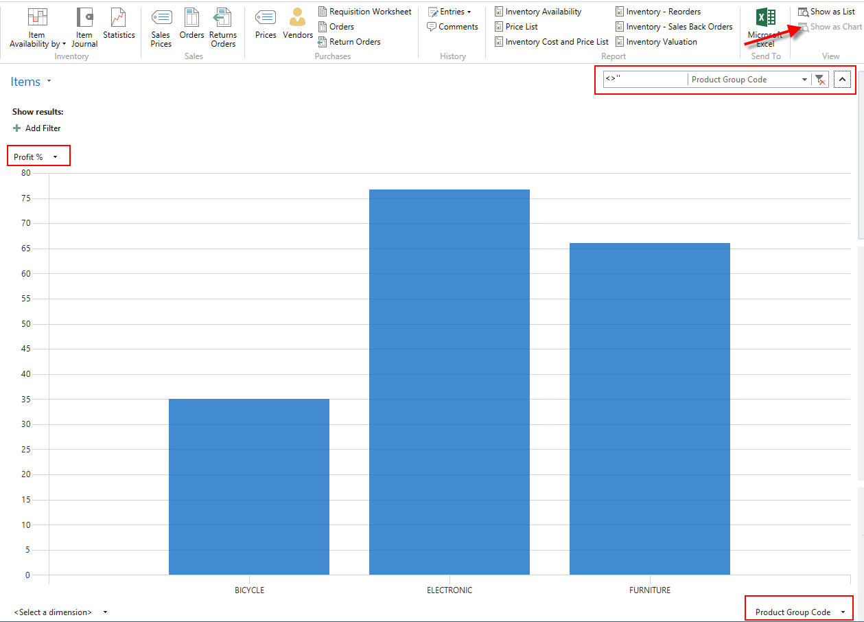
Right clicking on the chart, gives you the option to save the chart, print it or customise it.
The same type of graph can be built on the customer list to show the sales by customer group for example.
2. Generic Charts
To show the chart on your role center, it needs to be saved under the Generic charts. Out of the box, NAV 2015 has a few charts you can customise (eg. customer per salesperson).
In the below example I’ve created a new chart called Customer Sales vs. Profit by Location
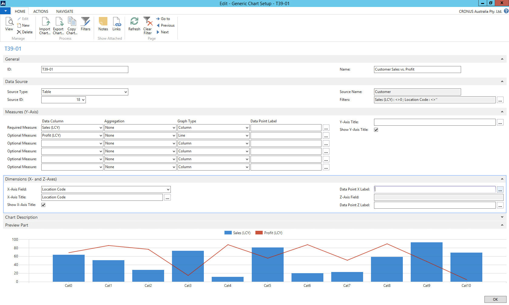
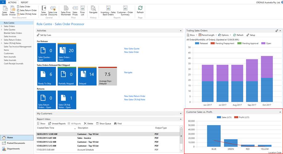
To view this chart, add it to the Role centre (click on Blue button at the top left –> Customize–> Customize this page–> Chart part–> Add. Select the Blank chart–> Customize part–> Select T39-01–> Click on OK). Now we see the above chart part in the role centre:
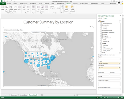
3. Charts in Excel
The lists can also be exported to Excel (CTRL+E). Use Power View to generate map charts.
Microsoft Dynamics NAV 2015 offers a few simple ways to build your own charts in a few clicks.